Increasing logged-in transactions by up to 60% without hurting conversion

UX

UI

CRO

Client: Trainline

My role: Lead Product Designer

Project: Increasing long-term customer value & engagement

Summary: 80% of Trainline customers were checking out as guests, limiting their ability to manage bookings and driving up contact centre costs. I led the design of a non-intrusive sign-in and registration system across UK and international platforms, testing multiple approaches to find interventions that increased logins without disrupting the booking flow. The result was a 59.2% increase in logged-in transactions on international mobile web and a 20% increase in registrations.

Outcome

  • +59.2% logged-in transactions — international mobile web
  • +39.8% logged-in transactions — international desktop web
  • +50.3% logged-in transactions — UK mobile web
  • +31.8% logged-in transactions — UK desktop web
  • +20% account registrations

International mobile web

The problem

Logged-in customers have double the long-term value of guest users. They can self-serve exchanges and refunds, reducing contact centre load, and they're easier to retain. Despite this, 80% of Trainline users were checking out as guests. The challenge wasn't just increasing logins. It was doing so without disrupting the booking flow or hurting conversion.

Sign in before changes

Registration before changes

Strategic objectives

Increase Sign-In and Registration Rates: Encourage users to log in or create accounts to enhance engagement.

Improve Self-Service Capabilities: Enable users to manage their bookings independently, reducing reliance on customer support.

Reduce Contact Centre Costs: Lower the volume of support enquiries through improved self-service options.

Maintain Conversion Rates: Ensure that changes have a positive or neutral impact on overall sales.

Align with New Design System: Update the UI to reflect Trainline's latest design guidelines.

Enhance Accessibility: Make the platform more inclusive for all users.

My Role

I led product design for the Engagement Squad, overseeing a midweight designer and working with a Product Owner, Business Analyst and dedicated dev team. I joined at the start of COVID, when remote working was new to everyone, which meant building effective collaboration practices from scratch. Overcommunicating became the deliberate standard, including regular design feedback sessions and check-ins with the midweight designer I was mentoring.

The central ambiguity

At the start of the project it wasn't clear how we could increase logins without hurting conversion, or convince customers to register instead of using guest checkout. Rather than designing to an assumption, we built a testing strategy across multiple variants and surfaces to find interventions that were additive rather than disruptive.

Exploring design options

Screen real estate is at a premium in a booking flow. We considered modals, separate pages and a popover. A separate page risked pulling users out of the flow and hurting conversion. A modal was more intrusive. The popover allowed us to keep customers in context, reuse the component universally across the site, and maintain a non-disruptive experience, at the cost of working within tight space constraints.

A decision I was overruled on

Within the popover, I advocated for email sign-in at the top level. 80% of customers register with email and social sign-in had low usage. The PM believed leading with social would feel easier and drive adoption. The PM's version launched. Trainline later iterated to the email-first approach I had originally recommended and it has been live that way for 6 years.

What the testing showed

Two findings changed how we approached the rest of the site.

First, prompting registration after a customer had already filled in their passenger details, rather than interrupting them earlier, significantly increased sign-ups. Catching users at a moment of lower friction proved more effective than interrupting the flow. This informed the inline approach we applied elsewhere.

Second, Google One Tap performed best with returning customers on the homepage, before they began booking. Testing it across multiple locations showed that placement and timing mattered as much as the feature itself.

Accessibility as a non-negotiable

The space constraints of the popover made accessibility easy to deprioritise. We didn't. I made it a priority from the start, the dev team backed this, and we tested with screen readers and ensured the component worked for keyboard users with limited mobility. Given that these were login touchpoints appearing across the entire site, getting this wrong would have had significant reach.

Deliverables

  • Reusable popover component for sign-in and registration.
  • Google One Tap sign-in for returning customers.
  • Mid-booking flow sign-in or registration prompt for UK users.
  • Refreshed static sign-in and registration pages.
  • International passenger details registration prompt.
  • Social sign-in prompt during passenger details entry.

Outcome

  • +59.2% logged-in transactions on international mobile web
  • +39.8% logged-in transactions on international desktop web
  • +50.3% logged-in transactions on UK mobile web
  • +31.8% logged-in transactions on UK desktop web
  • +20% account registrations
  • Reduced contact centre load
  • Neutral conversion impact throughout

International mobile web

International desktop web

UK mobile web

UK Desktop web

These results underscore the effectiveness of our user-centered design approach in enhancing user engagement and driving business growth.

Don't just take my word for it

David Willis

Head of Design at Trainline

“Working with Alison has been an absolute pleasure. From the moment she started it was obvious she was going to add value to our team - she supported in forming a successful new squad alongside Product and Engineering counterparts, championed design thinking, had a data informed opinion and put in the effort to get to know everyone and embed herself into the team culture even during remote working times.

Alison brings a wealth of knowledge, an infectious ‘get things done’ attitude and positive vibes, meaning even tackling problems with complex requirements happen in a true customer first way.

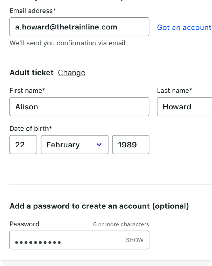
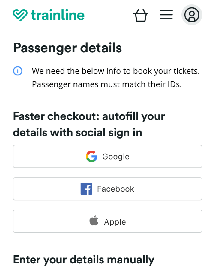
Whilst at Trainline she’s run design workshops, helped manage opportunity backlogs, completed rounds of customer testing and shipped so many cool improvements to the product.

We would gladly have her back as part of the team again in the future and she’ll be an asset to any team she joins.

More projects

Research

Service Design

UX

UI

From two broken apps to a unified EV experience

BP Pulse had two separate apps, 9 charging unit manufacturers with inconsistent interfaces, and non-standardised signage. I led research, service design and UX across the app, physical charging units and signage, expanding the brief beyond app consolidation to fix the full customer experience. I aligned engineering, procurement, signage and product teams throughout, and convinced the Head of Design to change the product direction based on research findings.

Research

UX

UI

CRO

HOTELS.COM million dollar navigation

As part of a rebrand, I redesigned the global navigation, balancing conversion goals, usability, and space for future offerings. By streamlining 89 regional variations and collaborating with stakeholders, the new design boosted engagement and conversions, adding USD $1.1M annually.