Outcome
A newly revamped fees page clearly communicates the impact of fees to Vanguard’s investors and uniquely positions them as the low-fee provider of choice.

Research
UX
Client: Vanguard Investments
My role: Senior UX Designer
Project: Make investing accessible to their UK market
Summary: Vanguard sought to position itself as the low-fee investment leader by showing how small fee increases impact long-term profits. I conducted research, created personas, mapped user journeys, designed wireframes, and worked with a researcher to test designs, ensuring customers understood fee impacts and value.
A newly revamped fees page clearly communicates the impact of fees to Vanguard’s investors and uniquely positions them as the low-fee provider of choice.
As the sole designer, I conducted research, mapped user journeys, developed wireframes, and collaborated with a user researcher to test and refine the designs.
If you invested a lump sum of £10,000 and contributed £100 a month for 40 years with a 7% return and paid 2% in fees you would lose 81% of your profits due to fees.
Many investors, even seasoned ones, underestimate how fees can erode their portfolios over time. Our goal was to clearly communicate Vanguard's low fees and illustrate their long-term benefits.
I examined how various industries present cost breakdowns, noting that tiered comparisons were particularly effective.
Focused on new and experienced investors' processes for selecting investments.
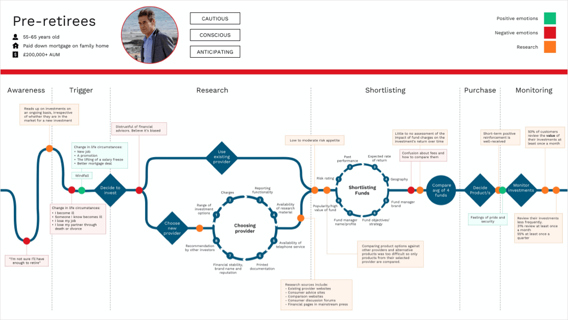
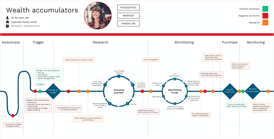
Identified key barriers, including understanding risks, financial literacy, and fee perceptions.
Developed layouts to clearly show Vanguard's fee breakdown and educate users on fee impacts.
Conducted lab sessions with 12 participants to gauge perceptions of fees before and after exposure to the new designs.
The user testing was very successful with customers shocked at the impact fees had on their portfolios over time. They were also able to clearly articulate what fees they would pay for different types of Vanguard funds and felt the breakdown was clear and simple.
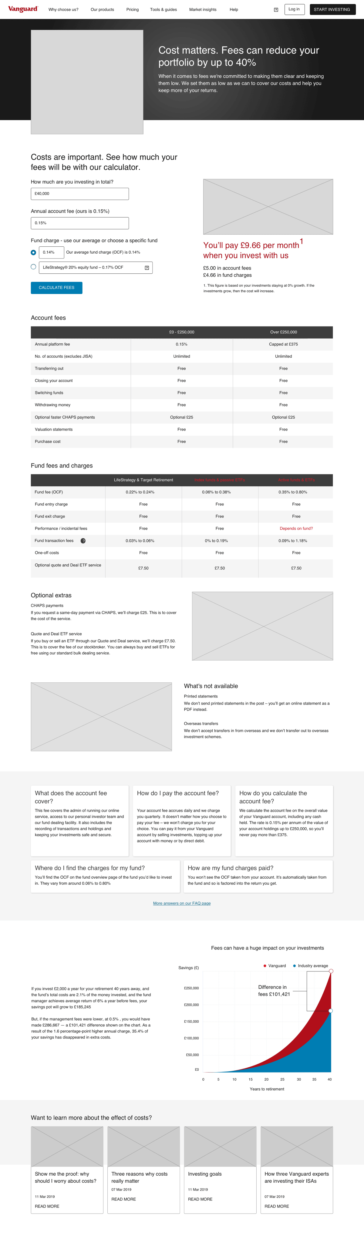

The positive research findings and wireframes were handed over to a UI designer for further development. Approximately 12 months later, the revamped fees page went live, offering investors clear insights into the impact of fees on their investments.
This project exemplifies the importance of transparent communication in empowering investors and enhancing user engagement.
Research
Service Design
UX
UI
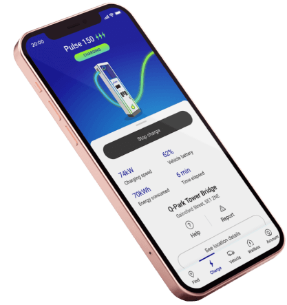
BP Pulse had two separate apps, 9 charging unit manufacturers with inconsistent interfaces, and non-standardised signage. I led research, service design and UX across the app, physical charging units and signage, expanding the brief beyond app consolidation to fix the full customer experience. I aligned engineering, procurement, signage and product teams throughout, and convinced the Head of Design to change the product direction based on research findings.
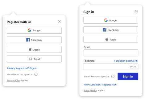
UX
UI
CRO
80% of Trainline customers were checking out as guests, limiting their ability to manage bookings and driving up contact centre costs. I led the design of a non-intrusive sign-in and registration system across UK and international platforms, testing multiple approaches to find interventions that increased logins without disrupting the booking flow. The result was a 59.2% increase in logged-in transactions on international mobile web and a 20% increase in registrations.